Bad vs Good Data Viz: A Simple Bar Chart Example
Exploring the fine line between clarity and clutter in data visualization for more effective data storytelling.
2 mins reading time
Data visualization serves as a bridge between raw data and actionable insights, but not all visualizations are created equal. Through a simple exercise using bar graphs, I wanted to explore and illustrate the fine line between clarity and clutter in data visualization.
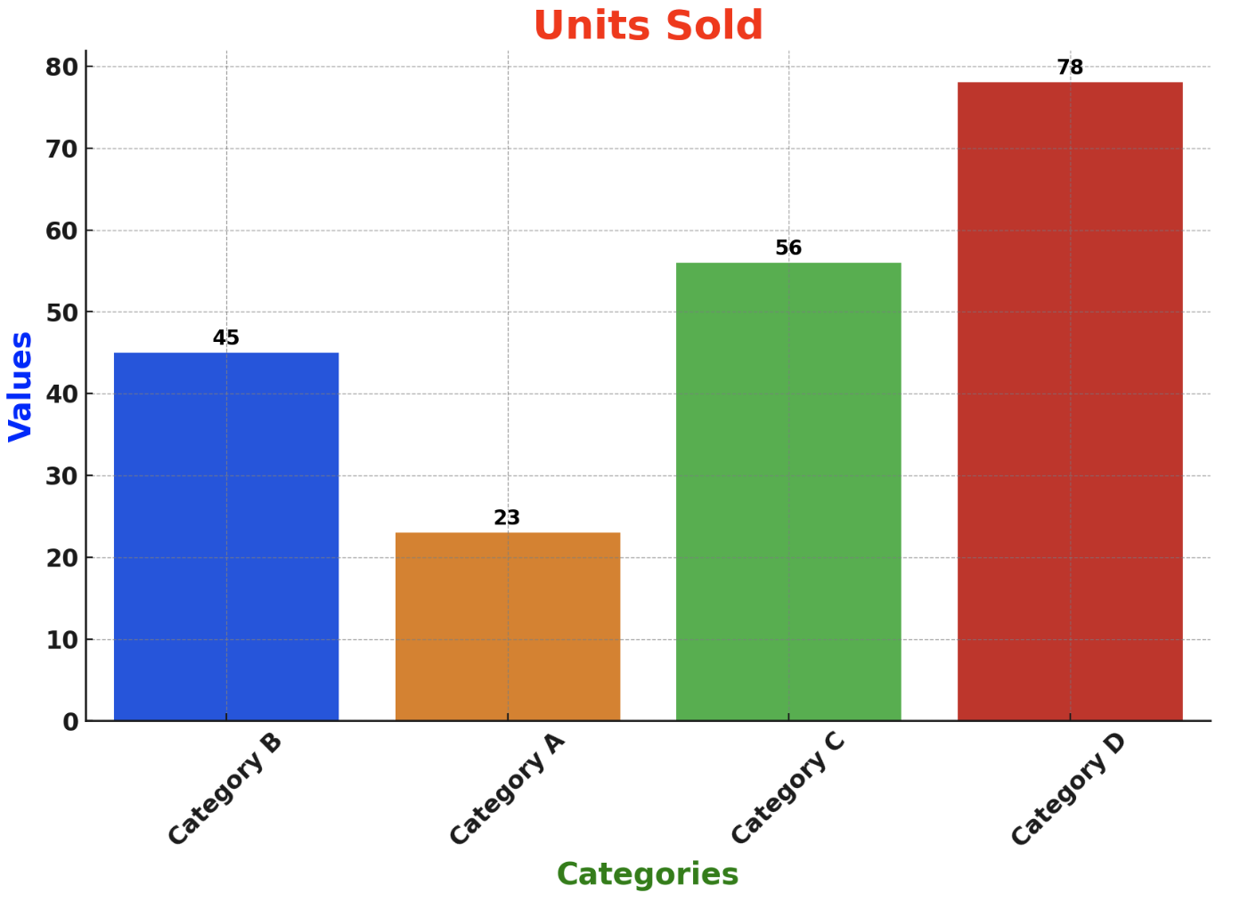
The Pitfalls of Poor Visualization
Our example begins with a graph that embodies common missteps in data visualization.
The graph shown below displays a fictitious example with units sold across various categories. In this example, the chart is overwhelmed by a barrage of bold colors, unnecessary annotations, and a cluttered design. The title and axis labels scream for attention in bold and varying colors, while the data points are buried under excessive embellishments. Categories are displayed randomly, making it hard to discern any order or priority. Gridlines in this case add complexity rather than clarity, resulting in a visual cacophony rather than a coherent narrative.
Refining for Clarity
The transformation towards a good data visualization requires stripping away the non-essentials.
By simplifying the color palette, we focus attention on the data. We highlight Category D to emphasize its significance (here it could also be driven by the narrative anchor), with other categories receding into the background in grey. The removal of gridlines, axis ticks, and the y-axis line further declutter the space, directing the viewer’s gaze to what matters most: the data and the insight. The graph’s title and subtitle are refined to not only convey the primary insight but also provide context in a subtle, unobtrusive manner.
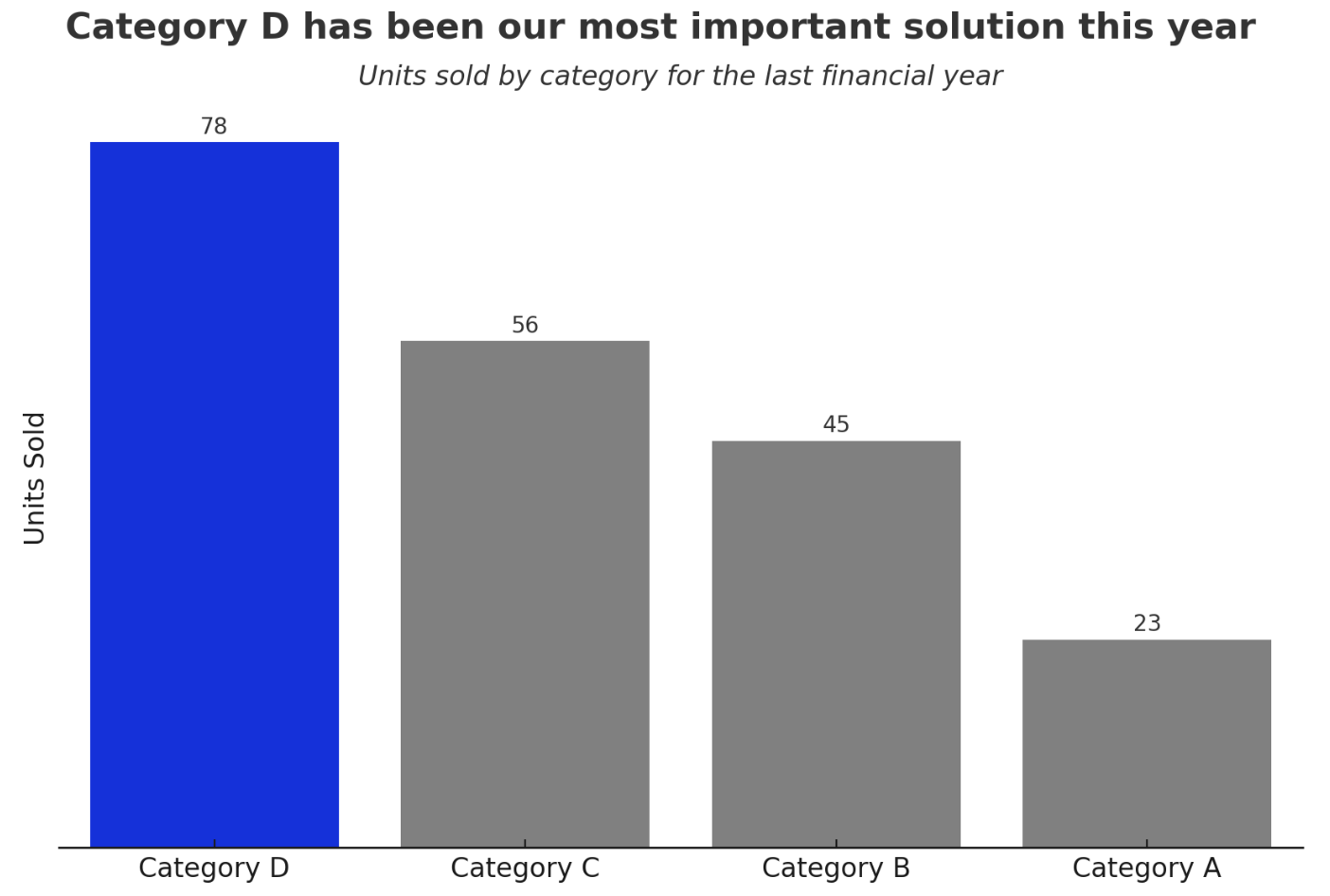
Further refinement saw the reordering of categories to present the data more logically, from the highest to the lowest units sold. This reordering facilitated an immediate understanding of category performance. Titles and subtitles were recreated, reflecting a modern aesthetic that guides the viewer through the information linearly and efficiently.
The journey from a cluttered to a clear visualization underscores the importance of thoughtful design. By prioritizing simplicity, focus, and a logical connection, we can transform raw data into compelling stories that inform, persuade, and inspire.
For another example of how to remove chart junk, I invite you to watch this YouTube video I put together to illustrate this concept.
And if you want to learn more about how you can create better data visualisation and storytelling solutions, check out my courses’ page.