Tips for Creating Better-Looking PowerBI Dashboards
Create better PowerBI designs and solutions to help you communicate and connect with your audience.
4 mins reading time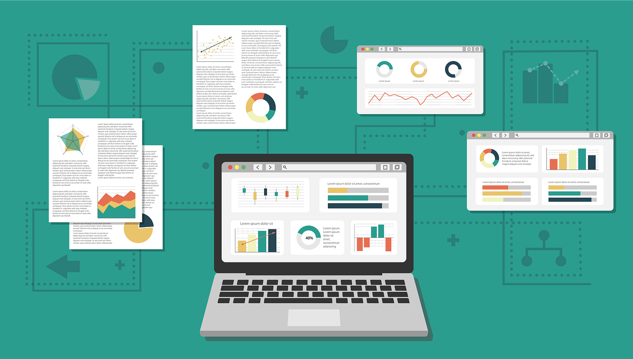
Creating effective PowerBI dashboards involves more than just compiling data and visuals. It requires a thoughtful approach to ensure that the end product is not only informative but also engaging and easy to navigate. As someone who works with data visualisation, I’ve seen many PowerBI dashboards. Some are great, but others could be improved. Here are some straightforward ways to make your PowerBI dashboards better, focusing on both looks and performance.
Start with a Plan
The foundation of a great dashboard is a clear objective. Before you begin designing your dashboard, it’s crucial to understand the purpose it serves. Ask yourself what insights you aim to provide and who the primary users will be. For example, if your dashboard is intended for sales managers, your focus might be on sales performance metrics, trends over time, and comparisons by region or product. This clarity of purpose will guide your design choices and ensure that every element of your dashboard aligns with the intended message. A common mistake is jumping straight into design without a plan, leading to dashboards that lack coherence and fail to communicate effectively.
Keep It Simple
A big problem with many dashboards is they try to show too much. This can overwhelm users. Keep your dashboard simple. Only show what’s important. Use space wisely to help guide users through your dashboard without making them feel lost. Focus on presenting only the most relevant data and use visual hierarchies to guide the viewer’s attention. For instance, instead of displaying every possible metric, select a few key indicators that provide meaningful insights into the performance of the business or project. Utilize whitespace to separate different sections of your dashboard, making it easier for users to digest the information.
Speed It Up
No one likes to wait. Making sure your dashboard loads and responds quickly is crucial. This means being smart about how you set it up. Avoid complex calculations if you can and think about how much detail you really need to show. Smaller, simpler data models can make your dashboard faster. This might involve reducing the granularity of your data where detailed information is not necessary or pre-aggregating data to speed up query times. For example, if you’re analyzing sales data, consider whether daily granularity is needed for all reports, or if weekly or monthly aggregates could suffice for some analyses.
Make It Yours
Customizing your dashboard can make it stand out. PowerBI has lots of options to change how your dashboard looks and feels. You can adjust colors, fonts, and layout to match your company’s style or to make things clearer for your users. Adding your touch can make a big difference. For example, if your company’s brand colors are blue and green, incorporate these colors into your dashboard design to create a cohesive look. Moreover, consider using custom icons or visuals that align with the data being presented, such as using a unique chart to display customer satisfaction scores that reflects your branding or visual language.
Add Interaction
Dashboards are more useful when users can explore the data themselves. Features like filters, drill-throughs, and hover details let users dig into the data in a way that makes sense to them. This turns your dashboard from a static report into a tool for discovery. For instance, a slicer could allow users to filter sales data by product category, region, or time period, enabling them to explore specific aspects of the data that interest them. Tooltips can offer additional context or definitions for metrics without cluttering the main view of the dashboard.
Tell a Story
The best dashboards don’t just show data; they tell a story. Think about what your data means and how you can guide users to understand it. Each part of your dashboard should help tell this story, making it easier for users to get insights and make decisions. For example, start with broad metrics that give an overview of performance, followed by trend analyses that show how metrics have changed over time, and conclude with detailed data breakdowns for in-depth analysis. This storytelling approach helps users connect with the data on a deeper level and facilitates a more intuitive understanding of what the data means for their business or project.
I hope that with these ideas you can create PowerBI dashboards that are not just good-looking but also powerful tools for understanding data. This way you can create dashboards that are easy to use, informative, and helpful for making decisions.