Simple Linear Regression - An example using R
Linear regression is a type of supervised statistical learning approach that is useful for predicting a quantitative response Y.
24 mins reading time
Linear regression is a type of supervised statistical learning approach that is useful for predicting a quantitative response Y. It can take the form of a single regression problem (where you use only a single predictor variable X) or a multiple regression (when more than one predictor is used in the model). It is one of the simplest and most straightforward approaches available and it is a starting point for more advanced modelling and predictive exercises.
This example will illustrate the application of a linear regression exercise using one single predictor (Simple Linear Regression). Our primary focus will be on the inferential aspect of the statistical learning exercise rather than on the its predicitve aspect.
The dataset we’ll used is called Prestige and comes from the car package library(car). The Prestige dataset is a data frame with 102 rows and 6 columns. Each row is an observation that relates to an occupation. The columns relate to predictors such as average years of education, percentage of women in the occupation, prestige of the occupation, etc.
Let’s load the required libraries and inspect the dataset:
# load the required packages.
library(car) # Library containing the dataset.
library(ggplot2) # Library to create some nice looking graphs.
library(MASS) # Library for our box-cox transform down the end.
# Inspect and summarize the data.
head(Prestige,5)
##                     education income women prestige census type
## gov.administrators      13.11  12351 11.16     68.8   1113 prof
## general.managers        12.26  25879  4.02     69.1   1130 prof
## accountants             12.77   9271 15.70     63.4   1171 prof
## purchasing.officers     11.42   8865  9.11     56.8   1175 prof
## chemists                14.62   8403 11.68     73.5   2111 prof
str(Prestige)
## 'data.frame':	102 obs. of  6 variables:
##  $ education: num  13.1 12.3 12.8 11.4 14.6 ...
##  $ income   : int  12351 25879 9271 8865 8403 11030 8258 14163 11377 11023 ...
##  $ women    : num  11.16 4.02 15.7 9.11 11.68 ...
##  $ prestige : num  68.8 69.1 63.4 56.8 73.5 77.6 72.6 78.1 73.1 68.8 ...
##  $ census   : int  1113 1130 1171 1175 2111 2113 2133 2141 2143 2153 ...
##  $ type     : Factor w/ 3 levels "bc","prof","wc": 2 2 2 2 2 2 2 2 2 2 ...
summary(Prestige)
##    education          income          women           prestige
##  Min.   : 6.380   Min.   :  611   Min.   : 0.000   Min.   :14.80
##  1st Qu.: 8.445   1st Qu.: 4106   1st Qu.: 3.592   1st Qu.:35.23
##  Median :10.540   Median : 5930   Median :13.600   Median :43.60
##  Mean   :10.738   Mean   : 6798   Mean   :28.979   Mean   :46.83
##  3rd Qu.:12.648   3rd Qu.: 8187   3rd Qu.:52.203   3rd Qu.:59.27
##  Max.   :15.970   Max.   :25879   Max.   :97.510   Max.   :87.20
##      census       type
##  Min.   :1113   bc  :44
##  1st Qu.:3120   prof:31
##  Median :5135   wc  :23
##  Mean   :5402   NA's: 4
##  3rd Qu.:8312
##  Max.   :9517
Since our focus in this example is the simple linear regression model, we’ll discard all other variables and keep only two: Income will be our target variable and education will be our predictor variable in the analysis.
# Subset the data to capture only income and education.
newdata = Prestige[,c(1:2)]
summary(newdata)
##    education          income
##  Min.   : 6.380   Min.   :  611
##  1st Qu.: 8.445   1st Qu.: 4106
##  Median :10.540   Median : 5930
##  Mean   :10.738   Mean   : 6798
##  3rd Qu.:12.648   3rd Qu.: 8187
##  Max.   :15.970   Max.   :25879
Now that we have our example subset, let’s have a look at how each variable is distributed. Below is the histogram of education:
# Histogram of the variable Education.
qplot(education, data = newdata, geom="histogram", binwidth=1) +
  labs(title = "Historgram of Average Years of Education") +
  labs(x ="Average Years of Education") +
  labs(y = "Frequency") +
  scale_y_continuous(breaks = c(1:20), minor_breaks = NULL) +
  scale_x_continuous(breaks = c(6:16), minor_breaks = NULL) +
   geom_vline(xintercept = mean(newdata$education), show.legend=TRUE, color="red") +
  geom_vline(xintercept = median(newdata$education), show.legend=TRUE, color="blue")
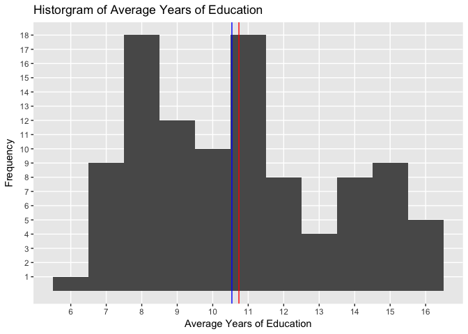
The histogram above allows us to see the pattern in the distribution of average years of education in the dataset. The blue vertical line shows the median value and the red line the average value.
Let’s now plot the histogram of Income:
# Histogram of the variable Income.
qplot(income, data = newdata, geom="histogram", binwidth=1000) +
  labs(title = "Historgram of Average Income") +
  labs(x ="Average Income") +
  labs(y = "Frequency") +
  scale_y_continuous(breaks = c(1:20), minor_breaks = NULL) +
  scale_x_continuous(breaks = c(0, 2000, 4000, 6000, 8000, 10000, 12000, 14000, 16000, 18000, 20000, 22000, 24000, 26000), minor_breaks = NULL) +
  geom_vline(xintercept = mean(newdata$income), show.legend=TRUE, color="red") +
  geom_vline(xintercept = median(newdata$income), show.legend=TRUE, color="blue")
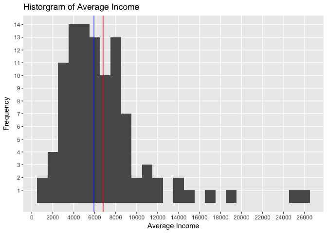
The histogram above shows the pattern in the distribution of average income. The blue vertical line shows the median value and the red line the average value.
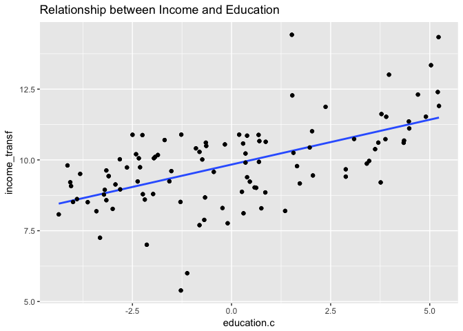
Finally, let’s draw a scatterplot of both variables to see their relationship:
# Create a plot of the subset data.
qplot(education, income, data = newdata, main = "Relationship between Income and Education") +
  scale_y_continuous(breaks = c(1000, 2000, 4000, 6000, 8000, 10000, 12000, 14000, 16000, 18000, 20000, 25000), minor_breaks = NULL) +
  scale_x_continuous(breaks = c(6:16), minor_breaks = NULL)
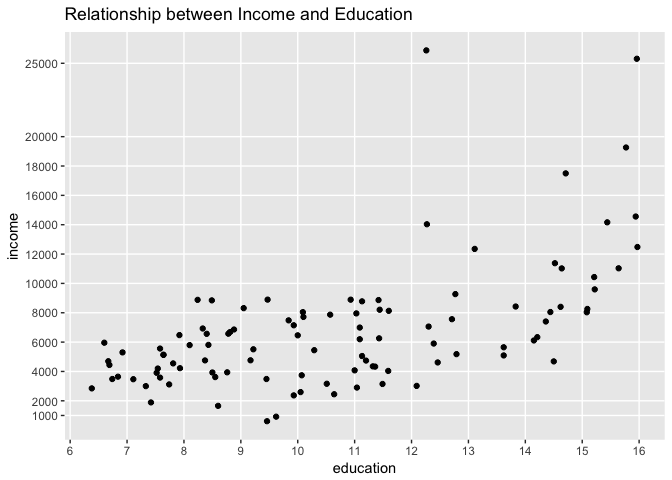
Each point in the graph represents a profession. Observe how income changes as years of education increases.
To keep within the scope of this example, we’ll fit a linear regression and see how well this model fits the observed data. We want to estimate the relationship and fit a line that explains this relationship.
In the most simplistic form, for our simple linear regression example, the equation we want to solve is:
\[Income = B0 + B1 * Education\]The model will estimate the value of the intercept (B0) and the slope (B1). In our case, the intercept is the expected income value for the average number of years of education and the slope is the average increase in income associated with a one-unit increase in years of education. We want our model to fit a line across the observed relationship in a way that the line created is as close as possible to all data points.
Let’s use R lm function. The lm function is used to fit linear models. For more details, see: https://stat.ethz.ch/R-manual/R-devel/library/stats/html/lm.html. Here we are using Least Squares approach.
# fit a linear model and run a summary of its results.
set.seed(1)
education.c = scale(newdata$education, center=TRUE, scale=FALSE)
education.c = as.data.frame(education.c)
names(education.c)[1] = "education.c"
newdata = cbind(newdata, education.c)
mod1 = lm(income ~ education.c, data = newdata)
summary(mod1)
##
## Call:
## lm(formula = income ~ education.c, data = newdata)
##
## Residuals:
##     Min      1Q  Median      3Q     Max
## -5493.2 -2433.8   -41.9  1491.5 17713.1
##
## Coefficients:
##             Estimate Std. Error t value Pr(>|t|)
## (Intercept)   6797.9      344.9  19.709  < 2e-16 ***
## education.c    898.8      127.0   7.075 2.08e-10 ***
## ---
## Signif. codes:  0 '***' 0.001 '**' 0.01 '*' 0.05 '.' 0.1 ' ' 1
##
## Residual standard error: 3483 on 100 degrees of freedom
## Multiple R-squared:  0.3336,	Adjusted R-squared:  0.3269
## F-statistic: 50.06 on 1 and 100 DF,  p-value: 2.079e-10
Let’s examine how the fitted line looks like in the scatterplot:
# visualize the model results.
qplot(education.c, income, data = newdata, main = "Relationship between Income and Education") +
  stat_smooth(method="lm", col="red", se=FALSE) +
  scale_y_continuous(breaks = c(1000, 2000, 4000, 6000, 8000, 10000, 12000, 14000, 16000, 18000, 20000, 25000), minor_breaks = NULL)
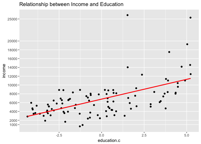
The result of the model and the graph with the fitted line is shown above.
Before we discuss the model output, note we created a new variable called education.c. This new variable centers the value of the variable education on its mean. This transformation was applied on the education variable so we could have a meaningful interpretation of its intercept estimate. Centering allows us to say that the estimated income when we consider the average number of years of education across the dataset is $6,798.
Had we not centered Education, we would have gotten a negative intercept estimate from the model and we would have ended up with a nonsensical intercept meaning (essentially saying that for a zero years of education, income is estimated to be negative - or the same as saying that no education means you owe money!)
From the model output and the scatterplot we can make some interesting observations:
-
Visually the scatterplot indicates the relationship between income and education does not follow a straight line. While this visual inspection alone is not a sufficient indication of non-linearity, this may suggest the relationship is in fact non-linear. Observe that our fitted line does not seem to follow pattern observed across all points.
-
While we can see a significant p-value (very close to zero), the model generated does not yield a strong $R^{2}$.$R^{2}$ (or coefficient of determination) is a measure that indicates the proportional variance of income explained by education. The closer the number is to 1, the better the model explains the variance shown. In our model results, the $R^{2}$ we get is 0.33, a pretty low score. This suggests the linear model we just fit in the data is explaining a mere 33% of the variance observed in the data.
-
Another interesting point from the model output is the residual standard error which measures the average amount of income that will deviate from the true regression line for any given point. In our example, any prediction of income on the basis of education will be off by an average of $3,483! A fairly large number.
-
Given that the Residual standard error for income is $3483 and the mean income value is $6798, we can assume that the average percentage error for any given point is more than 51%! Again, a pretty large error rate.
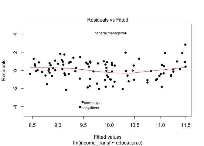
To throw some further evidence supporting the lack of model fit, let’s plot the residuals against the predicted values:
# visualize residuals and fitted values.
plot(mod1, pch=16, which=1)
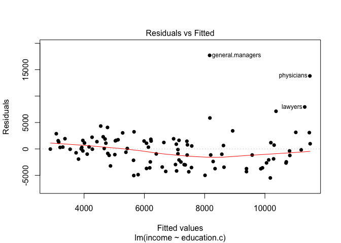
The graph above shows the model residuals (which is the average amount that the response will deviate from the true regression line) plotted against the fitted values (the model’s predicted value of income).
Ideally, when the model fits the data well, the residuals would be randomly scattered around the horizontal line. In our case here, there is strong evidence a non-linear pattern is present in the relationship. Also, there are points standing far away from the horizontal line. This could indicate the presence of outliers (note how the points for general managers, physicians and lawyers are way out there!).
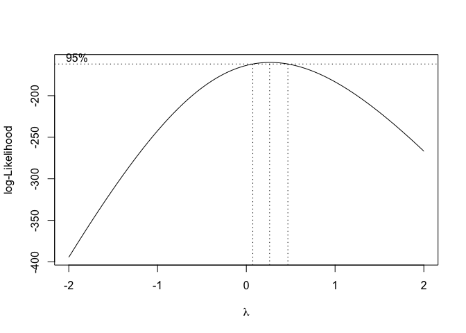
Next steps from here would include some transformation procedure of the variables. We could try transforming all variables by some sort of rule such as log or square root, etc. To avoid going through endless attempts to find an appropriate transformation to apply in the data, we’re going to transform only our response variable income using a procedure called Box-Cox power transformation.
Because we are fitting a linear model and our response variable is not really normally distributed, Box-Cox here can lend us a helping hand. Box-Cox is a procedure that identifies an appropriate exponent (called here lambda) to transform a variable into a normal shape. The lambda value indicates the power to which the variable should be raised.
Below is the plot results for the box-plot transform on the first model created mod:
# Run the box-cox transform on the model results and pin point the optimal lambda value.
trans = boxcox(mod1)
trans_df = as.data.frame(trans)
optimal_lambda = trans_df[which.max(trans$y),1]
After running the box-cox transformation, we identify the optimal lambda value in which we can raise our income variable. Let’s now add a new column variable in our data subset and call it income_transf. This variable will take the value of the optimal lambda and use it to power the existing values from the original income variable values:
# Create a new calculated variable based on the optimal lambda value and inspect the new dataframe.
newdata = cbind(newdata, newdata$income^optimal_lambda)
names(newdata)[4] = "income_transf"
head(newdata,5)
##                     education income education.c income_transf
## gov.administrators      13.11  12351   2.3719608      11.87376
## general.managers        12.26  25879   1.5219608      14.41969
## accountants             12.77   9271   2.0319608      11.01214
## purchasing.officers     11.42   8865   0.6819608      10.88339
## chemists                14.62   8403   3.8819608      10.73148
summary(newdata)
##    education          income       education.c     income_transf
##  Min.   : 6.380   Min.   :  611   Min.   :-4.358   Min.   : 5.391
##  1st Qu.: 8.445   1st Qu.: 4106   1st Qu.:-2.293   1st Qu.: 8.891
##  Median :10.540   Median : 5930   Median :-0.198   Median : 9.793
##  Mean   :10.738   Mean   : 6798   Mean   : 0.000   Mean   : 9.837
##  3rd Qu.:12.648   3rd Qu.: 8187   3rd Qu.: 1.909   3rd Qu.:10.658
##  Max.   :15.970   Max.   :25879   Max.   : 5.232   Max.   :14.420
The transformation of the income variable into a new variable called income_transf is done. What we can do now is re-run the model but with the response variable being income_transf:
# fit a linear model on the income_transf data and run a summary of its results.
mod2 = lm(income_transf ~ education.c, data = newdata)
summary(mod2)
##
## Call:
## lm(formula = income_transf ~ education.c, data = newdata)
##
## Residuals:
##     Min      1Q  Median      3Q     Max
## -4.0410 -0.6146  0.0123  0.8209  4.1006
##
## Coefficients:
##             Estimate Std. Error t value Pr(>|t|)
## (Intercept)  9.83702    0.12131  81.088  < 2e-16 ***
## education.c  0.31676    0.04468   7.089 1.94e-10 ***
## ---
## Signif. codes:  0 '***' 0.001 '**' 0.01 '*' 0.05 '.' 0.1 ' ' 1
##
## Residual standard error: 1.225 on 100 degrees of freedom
## Multiple R-squared:  0.3345,	Adjusted R-squared:  0.3278
## F-statistic: 50.26 on 1 and 100 DF,  p-value: 1.945e-10
qplot(income_transf, data = newdata, geom="histogram", binwidth=0.5) +
  labs(title = "Historgram of Average Income Transformed by Box-Cox") +
  labs(x ="Average Income") +
  labs(y = "Frequency") +
  geom_vline(xintercept = mean(newdata$income_transf), show.legend=TRUE, color="red") +
  geom_vline(xintercept = median(newdata$income_transf), show.legend=TRUE, color="blue")
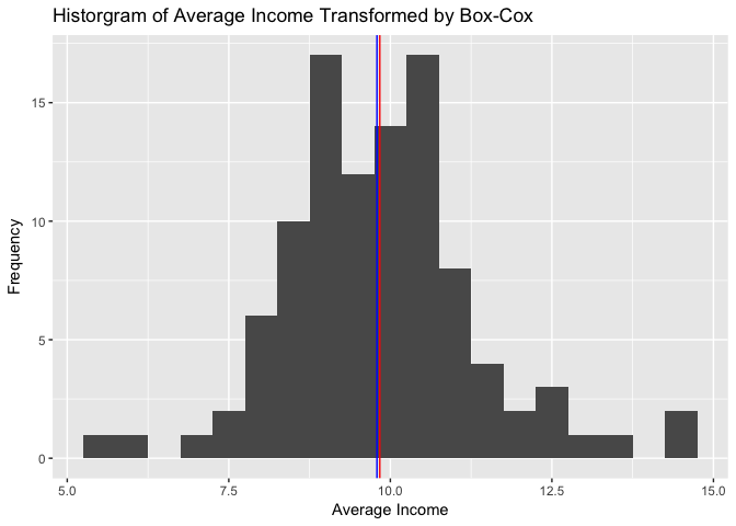
Note on the histogram above how the ‘shape’ of the income variable changed to a more ‘normally’ distributed form. We can still see some extreme values that are impacting the model fit.
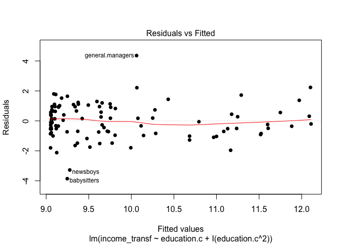
Let’s observe the model fit agains the observations:
qplot(education.c, income_transf, data = newdata, main = "Relationship between Income and Education") +
  stat_smooth(method = "lm", se=FALSE) +
  geom_point()
plot(mod2, pch=16, which=1)
From the output above, we can see that the box-cox transformation provided an unnoticeable improvement in the model results. We had negligeable improvement in the R-squared values. The graphs show how the box-cox transformation on the income variable ‘reshapes’ the data and gives it a more nomally distributed look. Note also how the second model’s residual plot indicates a more random pattern but the presence of points (some new ones) far away from the horizontal line still exist in the data.
These findings help sediment the belief that a non-linear model is more appropriate for this dataset.
It’s only natural now to consider a non-linear transformation of the predictor variable education. As an initial trial, let’s use the education centered value since now we are not concerned with the interpretation of the predictor coefficient values. Now, we want to check whether the model fit will improve by transforming the predictor education.c.
To make the case for it, let’s look back at the first scatterplot. Note how, in fact, the relationship between Income and Education is not linear. A quadratic transformation may be useful here. Let’s include our education.c variable plus a transformed education variable to the power of 2 (square it). And let’s create a new model with the transformation inside it:
# run new model with quadratic term.
mod3 = lm(income_transf ~ education.c + I(education.c^2), data = newdata)
summary(mod3)
##
## Call:
## lm(formula = income_transf ~ education.c + I(education.c^2),
##     data = newdata)
##
## Residuals:
##     Min      1Q  Median      3Q     Max
## -3.8563 -0.7253  0.0298  0.8871  4.3585
##
## Coefficients:
##                  Estimate Std. Error t value Pr(>|t|)
## (Intercept)       9.54069    0.17221  55.403  < 2e-16 ***
## education.c       0.28079    0.04624   6.073 2.33e-08 ***
## I(education.c^2)  0.04020    0.01694   2.373   0.0196 *
## ---
## Signif. codes:  0 '***' 0.001 '**' 0.01 '*' 0.05 '.' 0.1 ' ' 1
##
## Residual standard error: 1.198 on 99 degrees of freedom
## Multiple R-squared:  0.3703,	Adjusted R-squared:  0.3576
## F-statistic: 29.11 on 2 and 99 DF,  p-value: 1.141e-10
# plot residuals of the new model.
plot(mod3, pch=16, which=1)
# create 100 x-values based on range of plotted values and plot the quadratic line fit.
plot(income_transf ~ education.c, data=newdata, xlab = "education.c", ylab = "income_transf", main = "Quadratic Model Fit of Income and Education")
minmax = range(education.c)
xvals = seq(minmax[1], minmax[2], len=100)
yvals = predict(mod3, newdata=data.frame(education.c=xvals))
lines(xvals, yvals, col="red", lwd = 3)
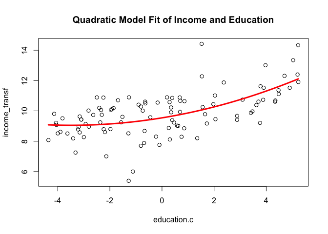
Note how in this updated model with the transformed predictor variable education.c, the R-squared value improved to 0.37. Our Residual standard error has also declined albeit marginally. The quadratic term education.c does not have a very significant p-value but it is still below 0.05. We can also see from the Residuals plot we can se some of the fitted values concentrating on the left side of the graph and some of the points still lying beyond the residual horizontal lines. The last graph shows the model fit (red line). Note how the squared term has drawn a curved shape sort of following the pattern in the data.
In the next example, we will extend the idea of a linear model and include more than one predictor. We will consider some of the challenges and procedures for modelling multiple predictors and some additional approaches to improve our model fit. Later on, we’ll also consider and work with non-parametric approaches and some linear model regularization procedures.