Multiple Regression Analysis in R - First Steps
In this example we'll extend the concept of linear regression to include multiple predictors.
86 mins reading time
In our previous study example, we looked at the Simple Linear Regression model. We loaded the Prestige dataset and used income as our response variable and education as the predictor. We generated three models regressing Income onto Education (with some transformations applied) and had strong indications that the linear model was not the most appropriate for the dataset.
In this example we’ll extend the concept of linear regression to include multiple predictors. Prestige will continue to be our dataset of choice and can be found in the car package library(car).
# Load the package that contains the full dataset.
library(car)
library(corrplot) # We'll use corrplot later on in this example too.
library(visreg) # This library will allow us to show multivariate graphs.
library(rgl)
library(knitr)
library(scatterplot3d)
Load the Prestige dataset once again:
# Inspect and summarize the data.
head(Prestige,5)
##                     education income women prestige census type
## gov.administrators      13.11  12351 11.16     68.8   1113 prof
## general.managers        12.26  25879  4.02     69.1   1130 prof
## accountants             12.77   9271 15.70     63.4   1171 prof
## purchasing.officers     11.42   8865  9.11     56.8   1175 prof
## chemists                14.62   8403 11.68     73.5   2111 prof
str(Prestige)
## 'data.frame':	102 obs. of  6 variables:
##  $ education: num  13.1 12.3 12.8 11.4 14.6 ...
##  $ income   : int  12351 25879 9271 8865 8403 11030 8258 14163 11377 11023 ...
##  $ women    : num  11.16 4.02 15.7 9.11 11.68 ...
##  $ prestige : num  68.8 69.1 63.4 56.8 73.5 77.6 72.6 78.1 73.1 68.8 ...
##  $ census   : int  1113 1130 1171 1175 2111 2113 2133 2141 2143 2153 ...
##  $ type     : Factor w/ 3 levels "bc","prof","wc": 2 2 2 2 2 2 2 2 2 2 ...
summary(Prestige)
##    education          income          women           prestige
##  Min.   : 6.380   Min.   :  611   Min.   : 0.000   Min.   :14.80
##  1st Qu.: 8.445   1st Qu.: 4106   1st Qu.: 3.592   1st Qu.:35.23
##  Median :10.540   Median : 5930   Median :13.600   Median :43.60
##  Mean   :10.738   Mean   : 6798   Mean   :28.979   Mean   :46.83
##  3rd Qu.:12.648   3rd Qu.: 8187   3rd Qu.:52.203   3rd Qu.:59.27
##  Max.   :15.970   Max.   :25879   Max.   :97.510   Max.   :87.20
##      census       type
##  Min.   :1113   bc  :44
##  1st Qu.:3120   prof:31
##  Median :5135   wc  :23
##  Mean   :5402   NA's: 4
##  3rd Qu.:8312
##  Max.   :9517
If you recall from our previous example, the Prestige dataset is a data frame with 102 rows and 6 columns. Each row is an observations that relate to an occupation. The columns relate to predictors such as average years of education, percentage of women in the occupation, prestige of the occupation, etc.
For our multiple linear regression example, we’ll use more than one predictor. Our response variable will continue to be Income but now we will include women, prestige and education as our list of predictor variables. Remember that Education refers to the average number of years of education that exists in each profession. The women variable refers to the percentage of women in the profession and the prestige variable refers to a prestige score for each occupation (given by a metric called Pineo-Porter), from a social survey conducted in the mid-1960s.
# Let's subset the data to capture income, education, women and prestige.
newdata = Prestige[,c(1:4)]
summary(newdata)
##    education          income          women           prestige
##  Min.   : 6.380   Min.   :  611   Min.   : 0.000   Min.   :14.80
##  1st Qu.: 8.445   1st Qu.: 4106   1st Qu.: 3.592   1st Qu.:35.23
##  Median :10.540   Median : 5930   Median :13.600   Median :43.60
##  Mean   :10.738   Mean   : 6798   Mean   :28.979   Mean   :46.83
##  3rd Qu.:12.648   3rd Qu.: 8187   3rd Qu.:52.203   3rd Qu.:59.27
##  Max.   :15.970   Max.   :25879   Max.   :97.510   Max.   :87.20
Our new dataset contains the four variables to be used in our model. It is now easy for us to plot them using the plot function:
# Plot matrix of all variables.
plot(newdata, pch=16, col="blue", main="Matrix Scatterplot of Income, Education, Women and Prestige")
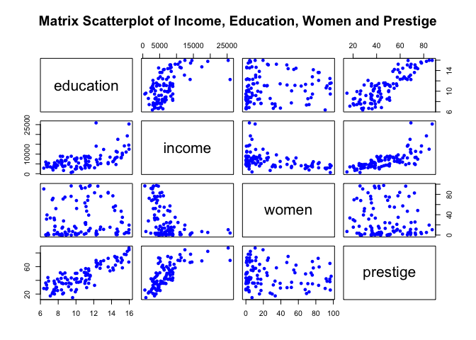
The matrix plot above allows us to vizualise the relationship among all variables in one single image. For example, we can see how income and education are related (see first column, second row top to bottom graph).
Another interesting example is the relationship between income and percentage of women (third column left to right second row top to bottom graph). Here we can see that as the percentage of women increases, average income in the profession declines.
Also from the matrix plot, note how prestige seems to have a similar pattern relative to education when plotted against income (fourth column left to right second row top to bottom graph).
To keep within the objectives of this study example, we’ll start by fitting a linear regression on this dataset and see how well it models the observed data. We’ll add all other predictors and give each of them a separate slope coefficient. We want to estimate the relationship and fit a plane (note that in a multi-dimensional setting, with two or more predictors and one response, the least squares regression line becomes a plane) that explains this relationship.
For our multiple linear regression example, we want to solve the following equation:
\[Income = B0 + B1 * Education + B2 * Prestige + B3 * Women\]The model will estimate the value of the intercept (B0) and each predictor’s slope (B1) for education, (B2) for prestige and (B3) for women. The intercept is the average expected income value for the average value across all predictors. The value for each slope estimate will be the average increase in income associated with a one-unit increase in each predictor value, holding the others constant. We want our model to fit a line or plane across the observed relationship in a way that the line/plane created is as close as possible to all data points.
Let’s start by using R lm function. The lm function is used to fit linear models. For more details, see: https://stat.ethz.ch/R-manual/R-devel/library/stats/html/lm.html. Here we are using Least Squares approach again.
set.seed(1)

# Center predictors.
education.c = scale(newdata$education, center=TRUE, scale=FALSE)
prestige.c = scale(newdata$prestige, center=TRUE, scale=FALSE)
women.c = scale(newdata$women, center=TRUE, scale=FALSE)

# bind these new variables into newdata and display a summary.
new.c.vars = cbind(education.c, prestige.c, women.c)
newdata = cbind(newdata, new.c.vars)
names(newdata)[5:7] = c("education.c", "prestige.c", "women.c" )
summary(newdata)
##    education          income          women           prestige
##  Min.   : 6.380   Min.   :  611   Min.   : 0.000   Min.   :14.80
##  1st Qu.: 8.445   1st Qu.: 4106   1st Qu.: 3.592   1st Qu.:35.23
##  Median :10.540   Median : 5930   Median :13.600   Median :43.60
##  Mean   :10.738   Mean   : 6798   Mean   :28.979   Mean   :46.83
##  3rd Qu.:12.648   3rd Qu.: 8187   3rd Qu.:52.203   3rd Qu.:59.27
##  Max.   :15.970   Max.   :25879   Max.   :97.510   Max.   :87.20
##   education.c       prestige.c         women.c
##  Min.   :-4.358   Min.   :-32.033   Min.   :-28.98
##  1st Qu.:-2.293   1st Qu.:-11.608   1st Qu.:-25.39
##  Median :-0.198   Median : -3.233   Median :-15.38
##  Mean   : 0.000   Mean   :  0.000   Mean   :  0.00
##  3rd Qu.: 1.909   3rd Qu.: 12.442   3rd Qu.: 23.22
##  Max.   : 5.232   Max.   : 40.367   Max.   : 68.53
# fit a linear model and run a summary of its results.
mod1 = lm(income ~ education.c + prestige.c + women.c, data=newdata)
summary(mod1)
##
## Call:
## lm(formula = income ~ education.c + prestige.c + women.c, data = newdata)
##
## Residuals:
##     Min      1Q  Median      3Q     Max
## -7715.3  -929.7  -231.2   689.7 14391.8
##
## Coefficients:
##             Estimate Std. Error t value Pr(>|t|)
## (Intercept) 6797.902    254.934  26.665  < 2e-16 ***
## education.c  177.199    187.632   0.944    0.347
## prestige.c   141.435     29.910   4.729 7.58e-06 ***
## women.c      -50.896      8.556  -5.948 4.19e-08 ***
## ---
## Signif. codes:  0 '***' 0.001 '**' 0.01 '*' 0.05 '.' 0.1 ' ' 1
##
## Residual standard error: 2575 on 98 degrees of freedom
## Multiple R-squared:  0.6432,	Adjusted R-squared:  0.6323
## F-statistic: 58.89 on 3 and 98 DF,  p-value: < 2.2e-16
The result of the model is shown above.
Similar to our previous simple linear regression example, note we created a centered version of all predictor variables each ending with a .c in their names. These new variables were centered on their mean. This transformation was applied on each variable so we could have a meaningful interpretation of the intercept estimates. Centering allows us to say that the estimated income is $6,798 when we consider the average number of years of education, the average percent of women and the average prestige from the dataset.
From the model output and the scatterplot we can make some interesting observations:
-
For any given level of education and prestige in a profession, improving one percentage point of women in a given profession will see the average income decline by $-50.9. Similarly, for any given level of education and percent of women, seeing an improvement in prestige by one point in a given profession will lead to an an extra $141.4 in average income.
-
Note also our Adjusted R-squared value (we’re now looking at adjusted R-square as a more appropriate metric of variability as the adjusted R-squared increases only if the new term added ends up improving the model more than would be expected by chance). In this model, we arrived in a larger R-squared number of 0.6322843 (compared to roughly 0.37 from our last simple linear regression exercise).
-
Recall from our previous simple linear regression exmaple that our centered education predictor variable had a significant p-value (close to zero). But from the multiple regression model output above, education no longer displays a significant p-value. Here, education represents the average effect while holding the other variables women and prestige constant. From the matrix scatterplot shown above, we can see the pattern income takes when regressed on education and prestige. Note how closely aligned their pattern is with each other. So in essence, when they are put together in the model, education is no longer significant after adjusting for prestige. When we have two or more predictor variables strongly correlated, we face a problem of collinearity (the predictors are collinear).
Let’s validate this situation with a correlation plot:
# Plot a correlation graph
newdatacor = cor(newdata[1:4])
corrplot(newdatacor, method = "number")
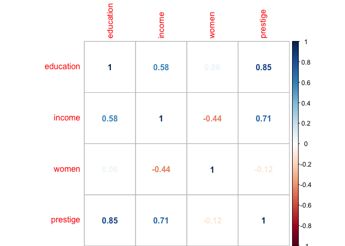
The correlation matrix shown above highlights the situation we encoutered with the model output. Notice that the correlation between education and prestige is very high at 0.85. This reveals each profession’s level of education is strongly aligned to each profession’s level of prestige. So in essence, education’s high p-value indicates that women and prestige are related to income, but there is no evidence that education is associated with income, at least not when these other two predictors are also considered in the model.
-
The model output can also help answer whether there is a relationship between the response and the predictors used. We can use the value of our F-Statistic to test whether all our coefficients are equal to zero (testing for the null hypothesis which means). The F-Statistic value from our model is 58.89 on 3 and 98 degrees of freedom. So assuming that the number of data points is appropriate and given that the p-values returned are low, we have some evidence that at least one of the predictors is associated with income.
-
Given that we have indications that at least one of the predictors is associated with income, and based on the fact that education here has a high p-value, we can consider removing education from the model and see how the model fit changes (we are not going to run a variable selection procedure such as forward, backward or mixed selection in this example):
# fit a linear model excluding the variable education
mod2 = lm(income ~ prestige.c + women.c, data=newdata)
summary(mod2)
##
## Call:
## lm(formula = income ~ prestige.c + women.c, data = newdata)
##
## Residuals:
##     Min      1Q  Median      3Q     Max
## -7620.9 -1008.7  -240.4   873.1 14180.0
##
## Coefficients:
##             Estimate Std. Error t value Pr(>|t|)
## (Intercept) 6797.902    254.795  26.680  < 2e-16 ***
## prestige.c   165.875     14.988  11.067  < 2e-16 ***
## women.c      -48.385      8.128  -5.953 4.02e-08 ***
## ---
## Signif. codes:  0 '***' 0.001 '**' 0.01 '*' 0.05 '.' 0.1 ' ' 1
##
## Residual standard error: 2573 on 99 degrees of freedom
## Multiple R-squared:   0.64,	Adjusted R-squared:  0.6327
## F-statistic: 87.98 on 2 and 99 DF,  p-value: < 2.2e-16
The model excluding education has in fact improved our F-Statistic from 58.89 to 87.98 but no substantial improvement was achieved in residual standard error and adjusted R-square value. This is possibly due to the presence of outlier points in the data.
Let’s plot this last model’s residuals:
# Plot model residuals.
plot(mod2, pch=16, which=1)
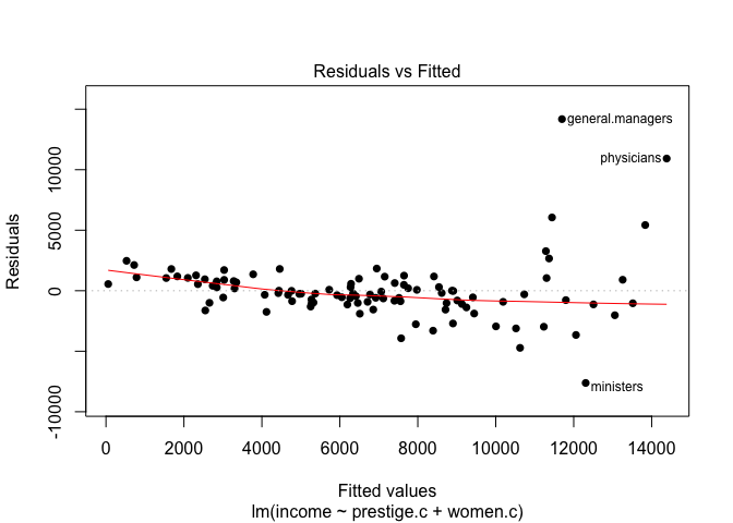
Note how the residuals plot of this last model shows some important points still lying far away from the middle area of the graph.
Let’s visualize a three-dimensional interactive graph with both predictors and the target variable:
newdat <- expand.grid(prestige.c=seq(-35,45,by=5),women.c=seq(-25,70,by=5))
newdat$pp <- predict(mod2,newdata=newdat)
with(newdata,plot3d(prestige.c,women.c,income, col="blue", size=1, type="s", main="3D Linear Model Fit"))
with(newdat,surface3d(unique(prestige.c),unique(women.c),pp,
                      alpha=0.3,front="line", back="line"))
You must enable Javascript to view this page properly.
Note from the 3D graph above (you can interact with the plot by cicking and dragging its surface around to change the viewing angle) how this view more clearly highlights the pattern existent across prestige and women relative to income. Also, this interactive view allows us to more clearly see those three or four outlier points as well as how well our last linear model fit the data.
At this stage we could try a few different transformations on both the predictors and the response variable to see how this would improve the model fit. For now, let’s apply a logarithmic transformation with the log function on the income variable (the log function here transforms using the natural log. If base 10 is desired log10 is the function to be used). Also, we could try to square both predictors. Let’s apply these suggested transformations directly into the model function and see what happens with both the model fit and the model accuracy.
# fit a model excluding the variable education,  log the income variable.
mod3 = lm(log(income) ~ prestige.c + I(prestige.c^2) + women.c + I(women.c^2) , data=newdata)
summary(mod3)
##
## Call:
## lm(formula = log(income) ~ prestige.c + I(prestige.c^2) + women.c +
##     I(women.c^2), data = newdata)
##
## Residuals:
##      Min       1Q   Median       3Q      Max
## -1.01614 -0.10973  0.00966  0.14479  0.80844
##
## Coefficients:
##                   Estimate Std. Error t value Pr(>|t|)
## (Intercept)      8.809e+00  5.944e-02 148.188  < 2e-16 ***
## prestige.c       2.518e-02  1.787e-03  14.096  < 2e-16 ***
## I(prestige.c^2) -2.605e-04  9.396e-05  -2.773  0.00666 **
## women.c         -6.306e-03  1.476e-03  -4.271 4.53e-05 ***
## I(women.c^2)    -7.194e-05  4.014e-05  -1.792  0.07620 .
## ---
## Signif. codes:  0 '***' 0.001 '**' 0.01 '*' 0.05 '.' 0.1 ' ' 1
##
## Residual standard error: 0.293 on 97 degrees of freedom
## Multiple R-squared:  0.7643,	Adjusted R-squared:  0.7546
## F-statistic: 78.64 on 4 and 97 DF,  p-value: < 2.2e-16
# Plot model residuals.
plot(mod3, pch=16, which=1)

newdat2 <- expand.grid(prestige.c=seq(-35,45,by=5),women.c=seq(-25,70,by=5))
newdat2$pp <- predict(mod3,newdata=newdat2)
with(newdata,plot3d(prestige.c,women.c,log(income), col="blue", size=1, type="s", main="3D Quadratic Model Fit with Log of Income"))
with(newdat2,surface3d(unique(prestige.c),unique(women.c),pp,
                      alpha=0.3,front="line", back="line"))
You must enable Javascript to view this page properly.
By transforming both the predictors and the target variable, we achieve an improved model fit. Note how the adjusted R-square has jumped to 0.7545965. Most predictors’ p-values are significant. Here, the squared women.c predictor yields a weak p-value (maybe an indication that in the presence of other predictors, it is not relevant to include and we could exclude it from the model.)
Let’s go on and remove the squared women.c variable from the model to see how it changes:
# fit a model excluding the variable education,  log the income variable.
mod4 = lm(log(income) ~ prestige.c + I(prestige.c^2) + women.c , data=newdata)
summary(mod4)
##
## Call:
## lm(formula = log(income) ~ prestige.c + I(prestige.c^2) + women.c,
##     data = newdata)
##
## Residuals:
##      Min       1Q   Median       3Q      Max
## -1.12302 -0.09650  0.02764  0.13913  0.78303
##
## Coefficients:
##                   Estimate Std. Error t value Pr(>|t|)
## (Intercept)      8.729e+00  4.023e-02 216.995  < 2e-16 ***
## prestige.c       2.499e-02  1.803e-03  13.858  < 2e-16 ***
## I(prestige.c^2) -2.351e-04  9.392e-05  -2.503    0.014 *
## women.c         -8.365e-03  9.376e-04  -8.922 2.64e-14 ***
## ---
## Signif. codes:  0 '***' 0.001 '**' 0.01 '*' 0.05 '.' 0.1 ' ' 1
##
## Residual standard error: 0.2963 on 98 degrees of freedom
## Multiple R-squared:  0.7565,	Adjusted R-squared:  0.7491
## F-statistic: 101.5 on 3 and 98 DF,  p-value: < 2.2e-16
# Plot model residuals.
plot(mod4, pch=16, which=1)

newdat3 <- expand.grid(prestige.c=seq(-35,45,by=5),women.c=seq(-25,70,by=5))
newdat3$pp <- predict(mod4,newdata=newdat3)
with(newdata,plot3d(prestige.c,women.c,log(income), col="blue", size=1, type="s", main="3D Quadratic Model Fit with Log of Income excl. Women^2"))
with(newdat3,surface3d(unique(prestige.c),unique(women.c),pp,
                      alpha=0.3,front="line", back="line"))
You must enable Javascript to view this page properly.
Note now that this updated model yields a much better R-square measure of 0.7490565, with all predictor p-values highly significant and improved F-Statistic value (101.5). The residuals plot also shows a randomly scattered plot indicating a relatively good fit given the transformations applied due to the non-linearity nature of the data.
In summary, we’ve seen a few different multiple linear regression models applied to the Prestige dataset. We tried an linear approach. We created a correlation matrix to understand how each variable was correlated. Subsequently, we transformed the variables to see the effect in the model. We’ve created three-dimensional plots to visualize the relationship of the variables and how the model was fitting the data in hand.
In next examples, we’ll explore some non-parametric approaches such as K-Nearest Neighbour and some regularization procedures that will allow a stronger fit and a potentially better interpretation. We’ll also start to dive into some Resampling methods such as Cross-validation and Bootstrap and later on we’ll approach some Classification problems.