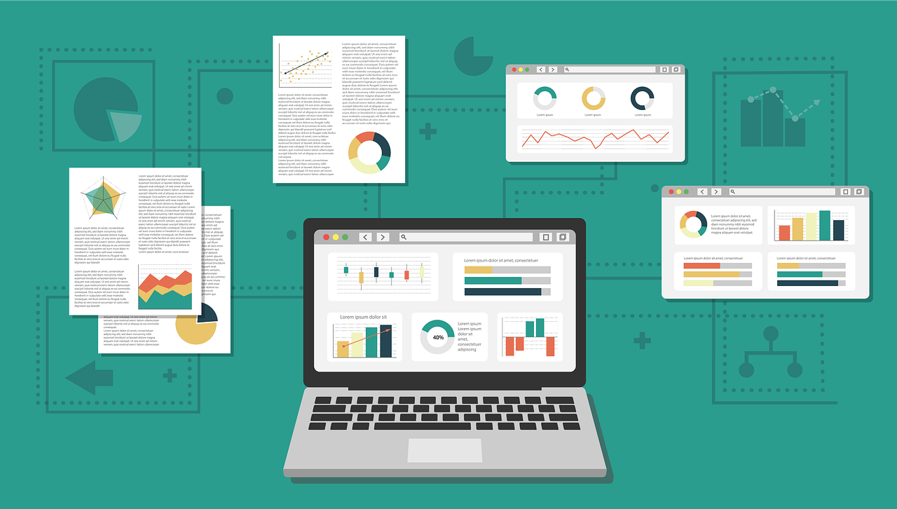
Data Visualization Predictions 2025

Discover emerging AI-driven trends transforming data visualization by 2025.
Discover emerging AI-driven trends transforming data visualization by 2025.
Create better PowerBI designs and solutions to help you communicate and connect with your audience.
Exploring the fine line between clarity and clutter in data visualization for more effective data storytelling.
Generative AI transforming data science, analytics, and visualization with LLM-powered agents.
Elevating marketing with data science: segmentation, recommenders, RFM analysis.

Enhancing data teams and leaders with design, communication and storytelling techniques.

Turn complex ideas and data into stories that resonate with your audience.

This is a bar chart race animation of daily COVID19 cases created using D3.js and Observable.

This post shows how easy it can be to geocode data using a custom script with google apps script in Google Sheets.

Mocking up data for analytics, datawarehouse or unit test can be challenging. This Python package is a fast and easy way to generate fake (mock) data.
An interview with Mike Sager, Vice-President of Customer Success of SiteMinder.
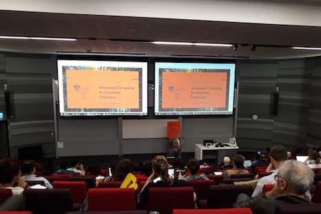
Highlights from the ACIC18 presented by The Sydney Informatics Hub at the University of Sydney
Slides for a talk I gave at Academy Xi on how to get into data science and analytics.
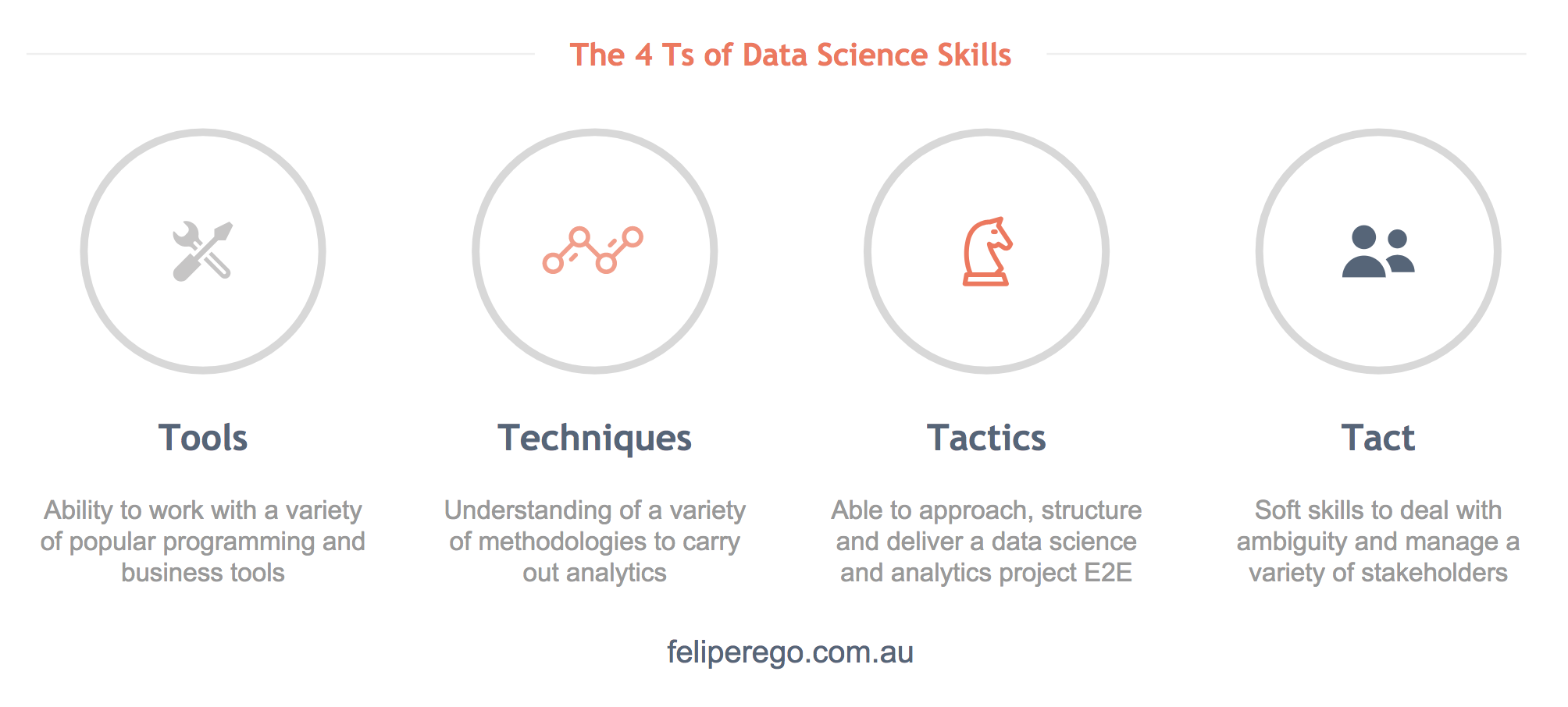
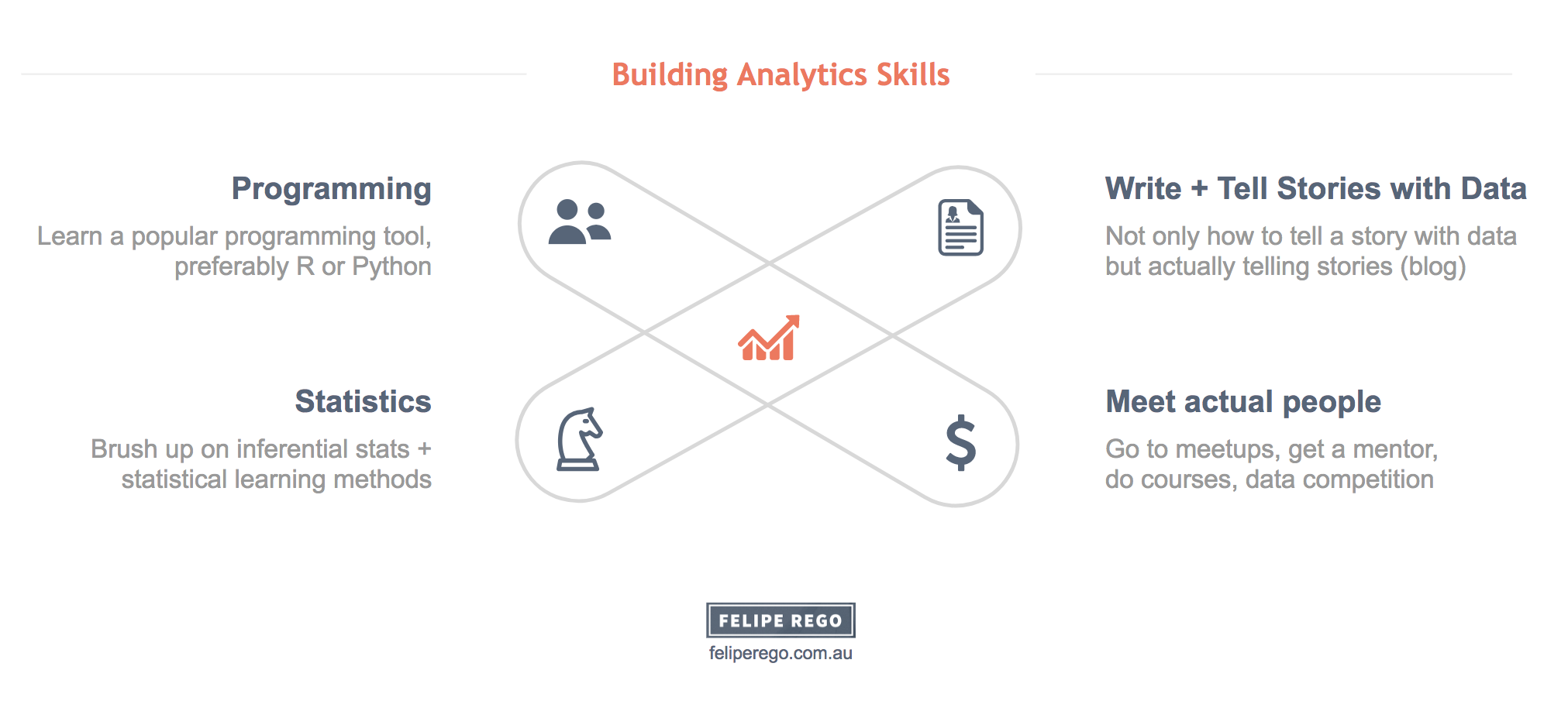
What are the key capabilities of a successful data science and analytics professional - now and in the future’? What are the things I should learn if I want to become a really good data science and analytics professional?

Three key learnings from a recent analytics project in partnership with The Works, a leading creative agency.

Joining me at Academy Xi are experts from leading organisations who will share their perspectives on all things big data and analytics.
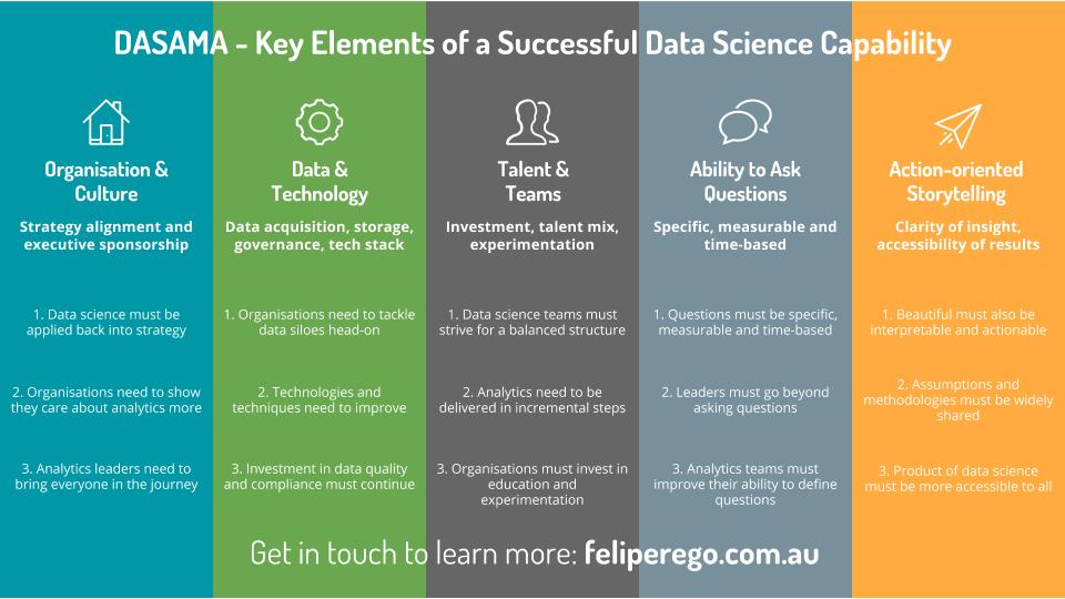
The DASAMA™ model has been developed to help organisations gain visibility on their data science and analytics journey.

In this blog post I wanted to build a simple solution to help online shoppers decide on the best size of clothes they should buy while online.

While all of these elements are non-data related, I'd argue they can have as much of an impact on your data analytics initiative as issues relating to data quality, choice of analytical tool, time spent fine-tuning algorithms, etc.

This is a mobile-friendly interactive dashboard created in Tableau looking at some data from NAPLAN 2017 Preliminary results.

Data that are obtained in series of points over an equally spaced period of time are generally referred to as Time series data.

This is a mobile-friendly interactive dashboard looking at data for holders of visa subclass 457 over the past 6 years (2010-2016) in Australia.

CAGR measures the mean growth rates of money or units / quantities of something over the years. This is a simple function in Python to calculate CAGR.

Principal Component Analysis (PCA) is a popular method used in statistical learning approaches.

This is a bunch of slides I put together for a talk I gave recently on data visualisation and storytelling in the context of analytics.

Linear regression models are a key part of the family of supervised learning models.
K-Means is a clustering approach that belogs to the class of unsupervised statistical learning methods.

This is a visualisation created using Plotly.

When we study approaches for predicting qualitative responses, we study classification problems.

Today we are going to deal with some Microsoft Excel spreadsheet data in R.

This visualisation is a product of the data wrangling work done in a previous post.

Thoughts and a simple approach to a Kaggle competition using Random Forest in Parallel

Resampling is a technique that allows us to repeatedly draw samples from a set of observations and to refit a model on each sample in order to obtain additional information.

In this example we'll extend the concept of linear regression to include multiple predictors.

Linear regression is a type of supervised statistical learning approach that is useful for predicting a quantitative response Y.